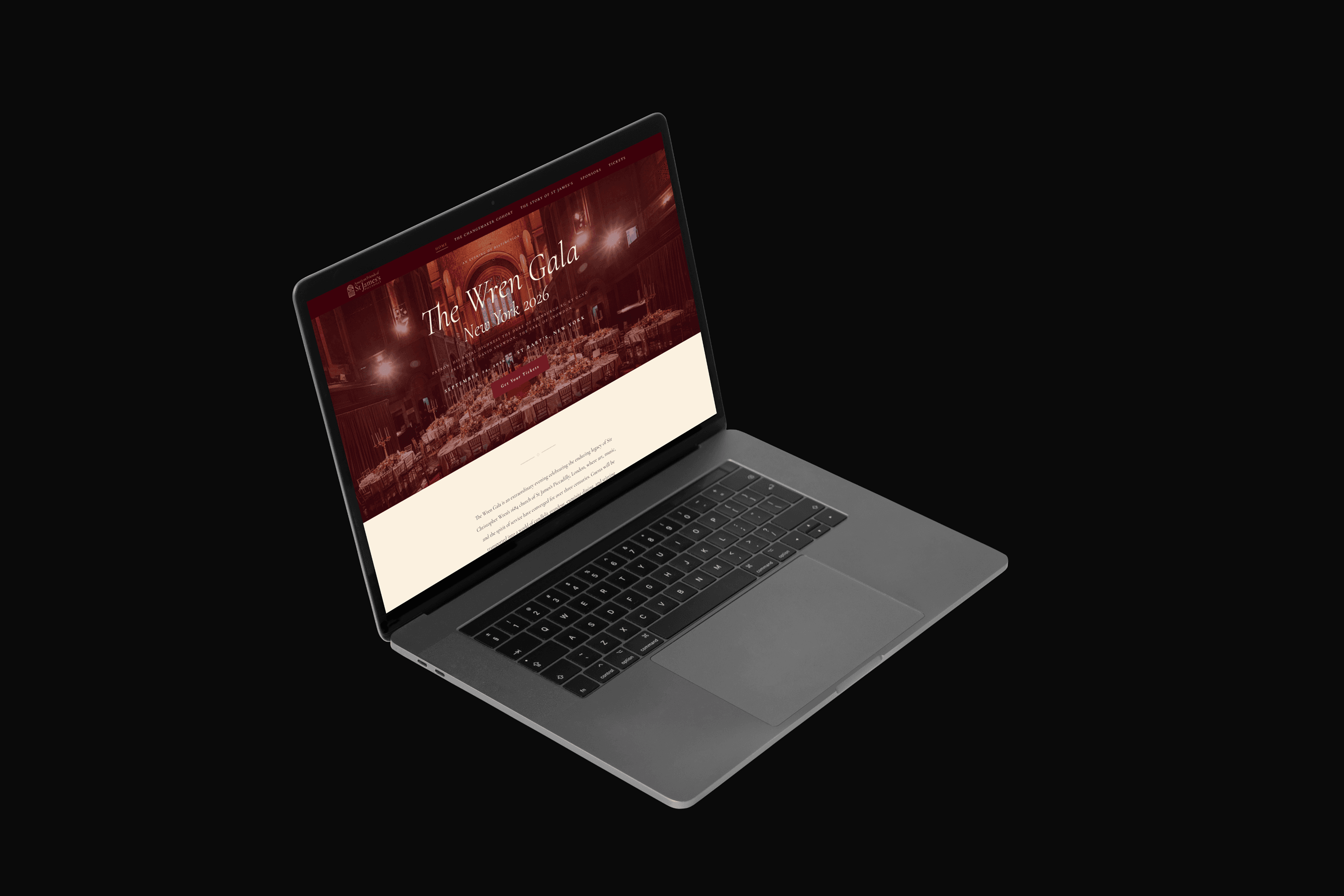
The Wren Gala
A luxury charity gala website for a historic London church, designed and shipped in under a week using AI-assisted development.
- Problem
- A historic London church needed a high-end digital presence for their annual New York fundraising gala. The team was distributed across London, Singapore, and New York with no dedicated digital operations resource on the US side.
- My Role
- Solo designer-developer and de facto product owner: visual direction, content strategy, AI tool evaluation, payment infrastructure, data management, email workflows, client communication, and mentoring a junior designer.
- Timeline
- Under 1 week from first client call to deployed site, evaluating three AI development approaches along the way.
- Outcome
- A 4-page luxury event website with Stripe payment integration, automated email workflows, and guest data management, deployed on Vercel. Zero hand-written code.
Context
St James Church in Piccadilly, London, hosts an annual charity gala in New York City. The church needed a dedicated website for the 2026 event that could do two things simultaneously: sell the prestige of the evening and convert visitors into ticket buyers.
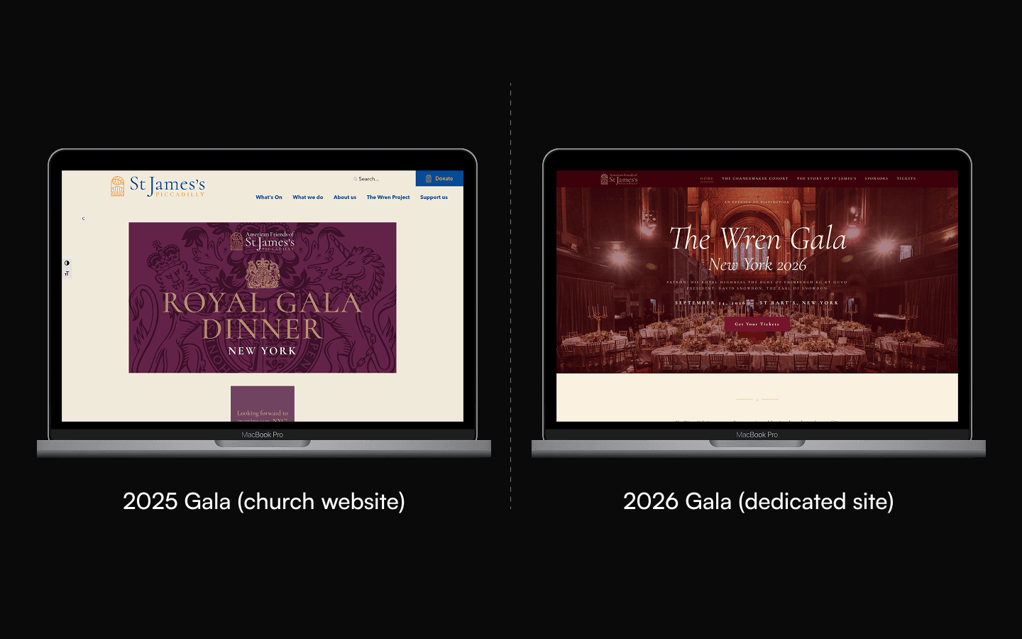
The existing church website served its purpose for general parish communications but was not built for event marketing. A gala in this category requires a specific visual register. Formal typography, restrained color, generous whitespace, and a sense of occasion. The site needed to feel like an invitation, not a brochure.
The scope was four pages: a homepage anchoring the event’s identity, a Changemaker Cohort page spotlighting the honorees, a Story of St James page connecting the church’s history to its mission, and a Tickets page with a purchase flow. Payment processing runs through Stripe for instant transactions.
The constraint was time. The entire site needed to ship in under a week.
Process
Visual Direction
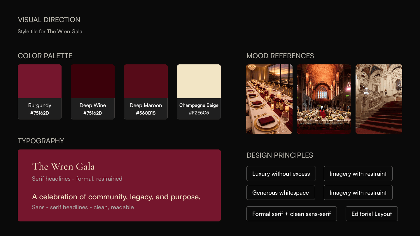
The visual language had to signal luxury without excess. The client’s event sits in a category alongside museum galas and foundation dinners, not tech launch parties. That meant a palette anchored in deep navy and warm gold, serif typography for headlines, clean sans-serif for body text, and imagery treated with restraint rather than spectacle.
I established the direction through mood boarding and rapid iteration directly in the browser rather than spending days in Figma. The compressed timeline made this the right call: the client could see real pages, not static comps, from day one.
Designing in the browser eliminated the handoff gap entirely. Every design review happened on a live URL. Feedback was immediate and specific because the client was reacting to real behavior, not a flat mockup.
AI Tool Evaluation
This project became a case study in AI-assisted design and development. I used three different AI tools across the timeline, each for a specific reason, and each with clear tradeoffs.
Generated static page templates quickly. Good for establishing layout structure and content hierarchy. Limited output when it came to animation, responsiveness, and interaction design.
- Fast layout generation and design token fidelity
- Good starting point for structure and content hierarchy
- No animation, responsiveness, or interaction support
- Useful as a starting point, not a production tool
Significantly better at producing polished, animated output. The results felt closer to a finished product. I abandoned it because the cost model did not make sense for a client project with a tight budget.
- Polished, animated output that felt production-ready
- Natural language to interaction: fast iteration loop
- Cost model didn’t make sense for a tight client budget
- Pricing prohibitive for the project scope
Full control over every line of code. No per-generation cost beyond the subscription. The output was production-ready and deployable directly to Vercel. I prompted, reviewed, iterated, and shipped without hand-typing a single line of code.
- Full control over every decision
- No per-generation cost beyond subscription
- Production-ready output, deployable to Vercel
- Zero hand-typed code — shipped in under a week
The value of evaluating multiple AI tools was not just about finding the cheapest option. It was about understanding what each tool optimizes for. Figma Make optimizes for speed of static output. Lovable optimizes for visual polish. Claude optimizes for control and iteration depth. Knowing when to switch tools is itself a design skill.
Content Strategy
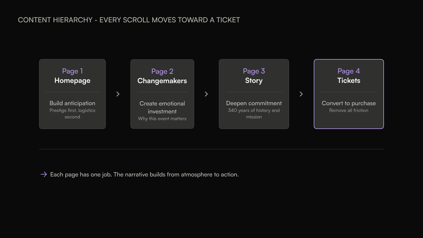
A gala website is not an information site. It is a persuasion tool. Every page needed a clear job: the homepage builds anticipation, the Changemaker page creates emotional investment in the cause, the Story page lends historical weight, and the Tickets page removes friction from the purchase decision.
I structured the content hierarchy around a single principle: every scroll should move the visitor closer to purchasing a ticket. The homepage leads with the event’s prestige, not with logistical details. Date, time, and venue appear, but they are secondary to the emotional register. The Tickets page strips away everything that is not directly relevant to completing the transaction.
Mentoring Through the Process
I brought a junior designer into the project as a learning opportunity. Rather than assigning isolated tasks, I structured the mentorship around the AI workflow itself. The junior designer observed how I evaluated tools, wrote prompts, reviewed output, and made iteration decisions.
The key lesson was that AI tools do not replace design judgment. They compress execution time. The decisions about visual hierarchy, content structure, interaction patterns, and responsive behavior still require a designer who understands why those decisions matter. The junior designer left the project with a working mental model for when AI tools are useful and when they introduce risk.
Payment Platform Evaluation
The ticket purchase flow went through its own evaluation cycle, separate from the build tools. The pattern was the same: evaluate, adopt, hit a constraint, switch.
The initial plan was Rayze. It was ruled out early because the platform does not support event ticketing. The scope simply did not fit.
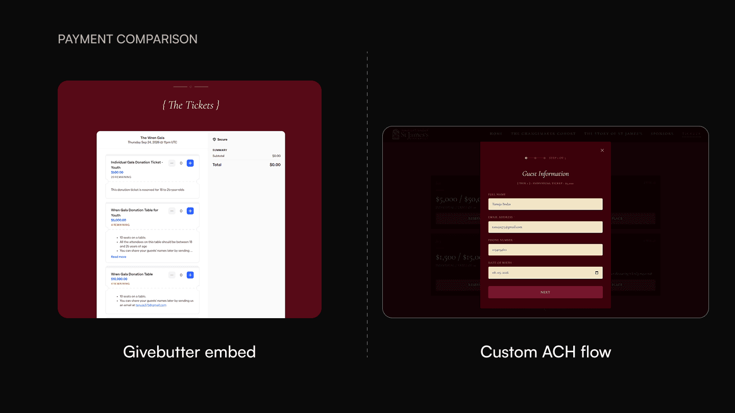
The second option was Givebutter, a donation and fundraising platform with event support. I integrated it, the client approved the setup, and it technically worked. The problem was visual. Givebutter’s UI is not fully customizable. The embedded ticketing experience broke from the site’s formal, luxury aesthetic. A guest scrolling through deep navy and gold typography would land on a payment form that looked like a different product entirely. For a general nonprofit fundraiser, that mismatch might be acceptable. For a gala in this category, it was not.
The initial replacement was ACH transfers with Airtable for data storage. This restored full visual control over the purchase experience. However, the client later required instant payment processing rather than waiting for bank transfers to clear. The final solution was Stripe integration, which delivered both instant payments and a checkout experience that could be styled to match the site’s visual language.
Each transition was driven by a specific, defensible reason: Rayze did not support ticketing, Givebutter could not match the visual standard, ACH could not process payments instantly. The final move to Stripe resolved every constraint: visual control, instant processing, and a seamless checkout experience.
Solution
Four pages, each with a specific persuasion job. The visual language holds through every surface: dark navy background, warm gold accents, serif display type, and generous whitespace that signals occasion rather than urgency.
Homepage
The homepage establishes the event’s visual identity in the first viewport. A full-bleed hero image, the gala name in a serif headline, the date and venue, and a single call-to-action. No navigation clutter above the fold. The goal is atmosphere first, logistics second.
Below the fold, the page introduces the mission, previews the Changemaker cohort, and provides a second ticket CTA. The scroll rhythm alternates between image-heavy and text-heavy sections to maintain visual interest without overwhelming.
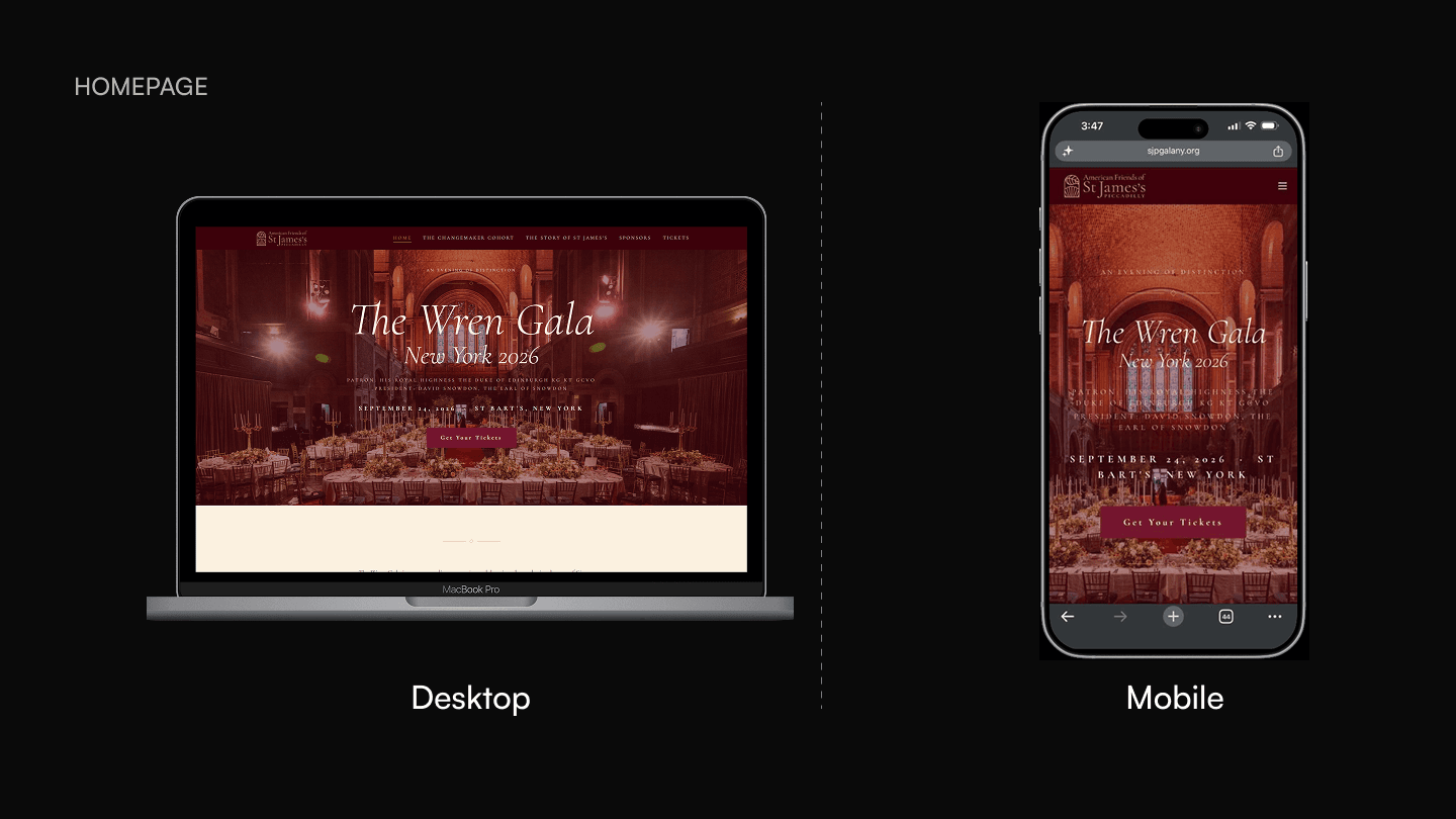
The single-CTA hero was a deliberate choice. Event websites often front-load navigation, sponsor logos, and secondary links. That dilutes attention. A gala at this level should feel like you are being welcomed, not marketed to.
Changemaker Cohort Page
This page profiles the individuals being honored at the gala. Each profile card includes a portrait, a name, a title, and a short narrative about their contribution. The layout uses a grid that adapts from three columns on desktop to a single stack on mobile.
The profiles are written to connect each person’s work to the church’s broader mission. The page is not a directory. It is an argument for why this event matters and why attendance is a form of participation in the mission.
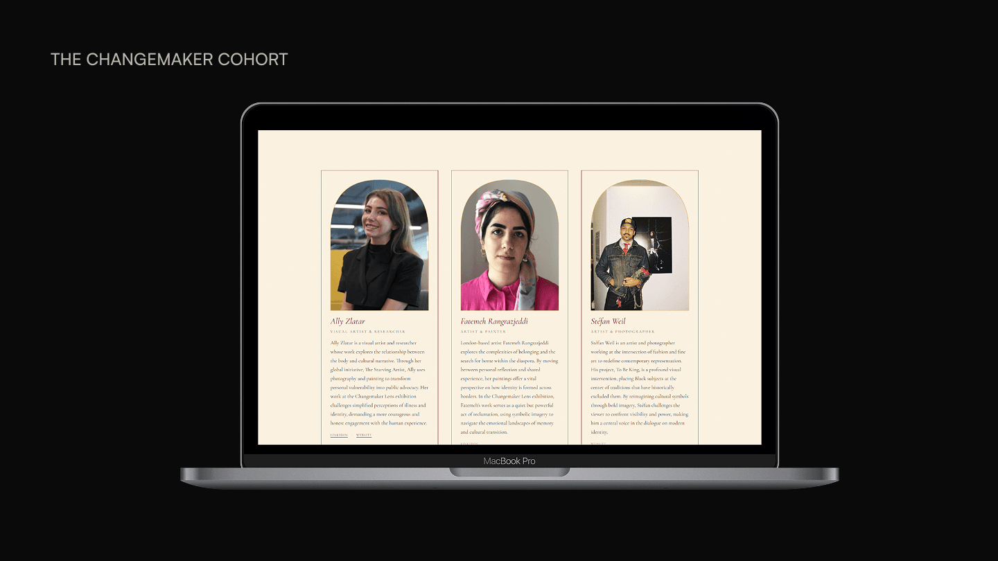
Profile cards use a consistent template rather than bespoke layouts per person. This was a practical choice (faster to produce, easier to update) and a design choice (visual consistency signals institutional seriousness).
Story of St James
This page connects the 2026 gala to the church’s 340-year history. The content moves chronologically, from the church’s founding through its restoration, its community programs, and its expansion into international philanthropy.
The design uses a scrolling narrative format with large section breaks, archival imagery, and pull quotes. The pacing is slower than the homepage by design. A visitor who reaches this page is already interested. The goal is to deepen commitment, not create urgency.
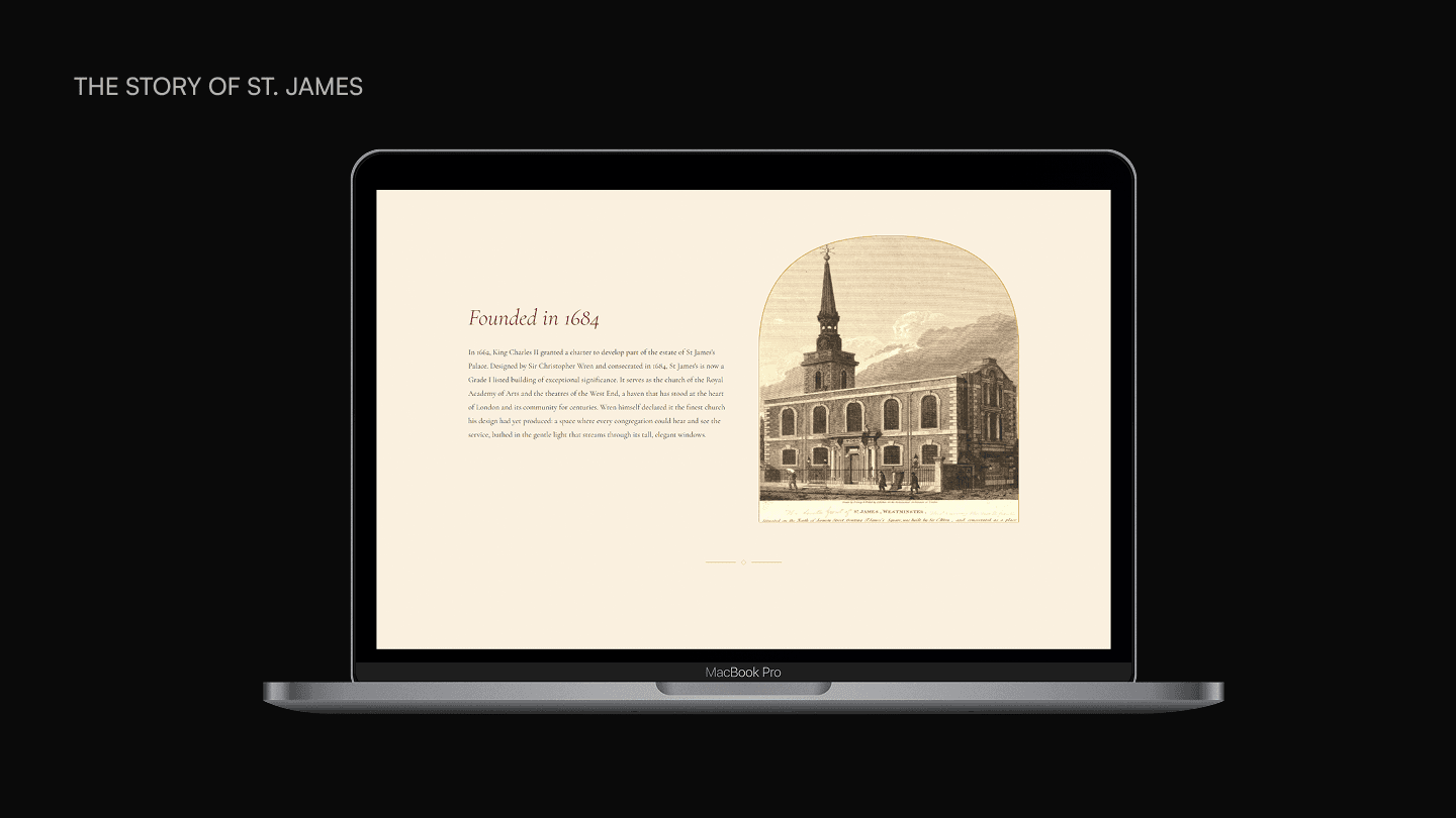
Using a linear narrative rather than a tabbed or accordion layout was intentional. The church’s story gains power from continuity. Breaking it into collapsed sections would have undermined the sense of unfolding history.
Tickets Page & Purchase Flow
The Tickets page is where the entire site’s persuasion arc resolves into action. It presents ticket tiers and drives the visitor toward a single outcome: completing the purchase.
This page went through more iteration than any other because of the payment platform changes. The initial Givebutter integration was functional but visually dissonant. The embedded UI introduced colors, typography, and spacing that broke from the site’s established language. The final integration with Stripe delivered both instant payment processing and full visual control over the checkout experience. Every element of the form, confirmation state, and receipt now matches the gala’s design system.
The page design eliminates all secondary content. No sidebar, no footer links, no related content. Once a visitor lands here, the only action available is completing the purchase. Form fields are minimal: name, email, ticket selection, payment. Error states are inline. Confirmation is immediate.
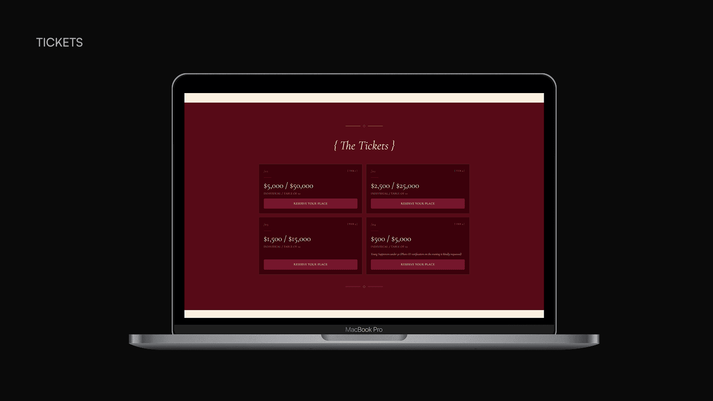
Removing navigation from the ticket purchase flow was a conversion-focused choice. Every link that is not “complete your purchase” is a potential exit. But the deeper decision was rejecting a working integration (Givebutter) because it compromised brand coherence. A luxury event cannot have a generic checkout. The visual standard has to hold through the final interaction, not just the marketing pages.
Tanuja has an exceptional eye for design and created a website that is both elegant and intuitive, perfectly capturing the feel of our event. Beyond the aesthetics, she also brought the technical expertise needed to seamlessly integrate our Stripe payment system, making the entire donor and ticket purchasing experience effortless.
Throughout the project, we went through many rounds of feedback and refinements, and Tanuja was consistently patient, thoughtful, and incredibly responsive. She listened carefully to every comment, offered practical solutions, and approached each revision with professionalism and grace.
Reflection
What I learned
AI tools are not interchangeable. Each one optimizes for a different output quality, and the skill is in evaluating fit quickly rather than committing to one tool and forcing it to work. Figma Make, Lovable, and Claude each had clear strengths and hard limits. The project worked because I switched tools at the right moments.
Speed is a design decision. Shipping in under a week was not about cutting corners. It was about using AI to compress the build phase so I could spend more time on design thinking, content strategy, and client alignment. The time saved on code was reinvested in the decisions that actually shape the user experience.
Prompting is a design skill. The quality of AI output is directly tied to the clarity of the input. Writing effective prompts requires the same discipline that good design requires: knowing what you want, understanding constraints, and communicating tradeoffs.
What I’d do differently
I would establish the AI tool choice before starting rather than evaluating three tools sequentially. The evaluation was valuable as a learning exercise, but on a future project with the same time constraint, I would go directly to Claude + VS Code based on what I now know about the tradeoffs.
I would also build a lightweight analytics setup from the start to capture site traffic, ticket page visits, and conversion data. The gala has not yet taken place, so there are no outcome metrics to report. Having analytics in place from launch would have made it possible to share meaningful data regardless of timing.