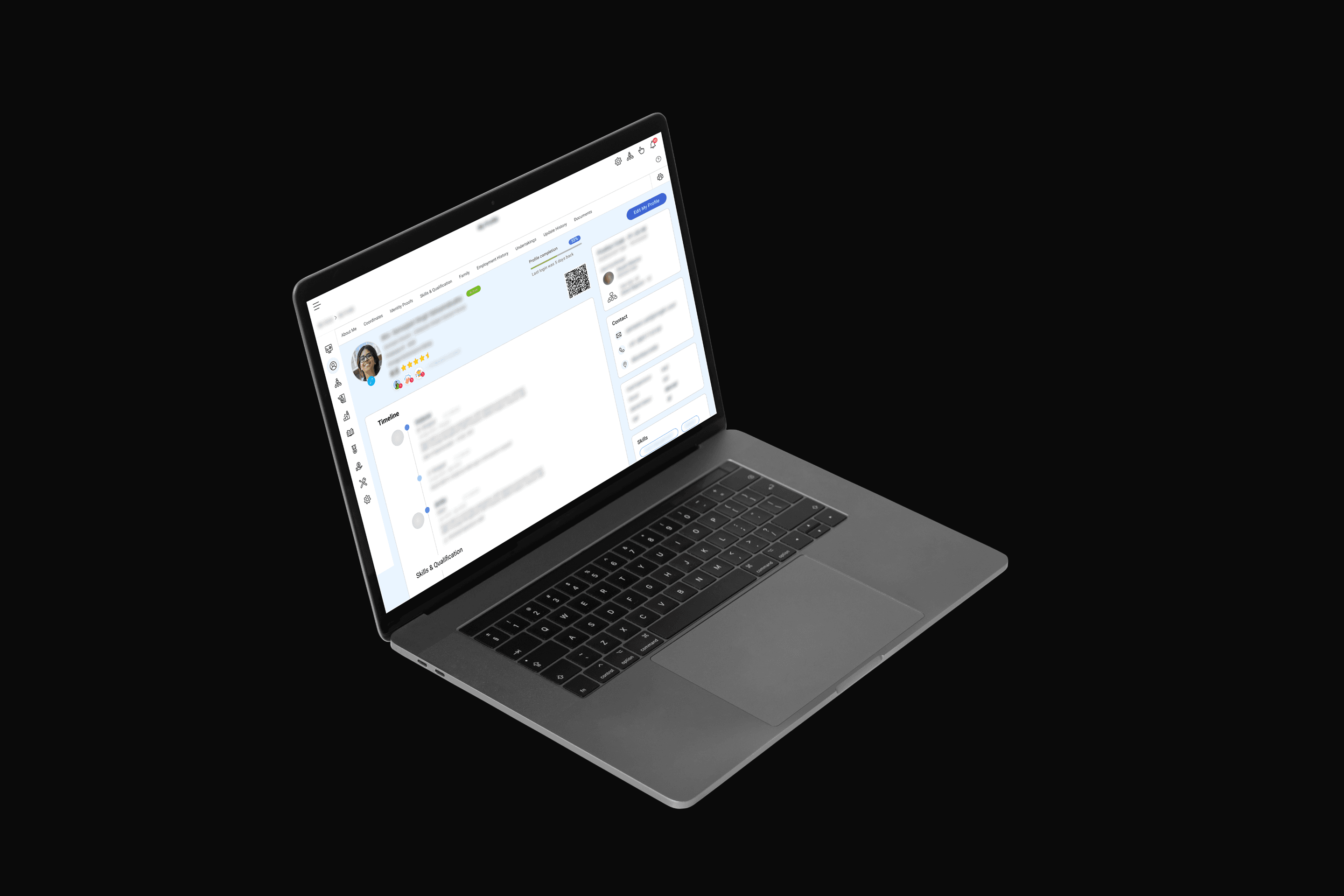
Employee Dossier
Redesigning ZingHR's centralized employee record into a single, scannable page that HR teams could actually use.
- Problem
- HR teams were navigating through multiple tabs and nested menus to access basic employee information. Critical data was buried, causing delays in everyday HR workflows and frustration across the organization.
- My Role
- Product designer responsible for restructuring the information architecture, redesigning the page layout, and simplifying navigation for ZingHR's most-used module.
- Timeline
- 8-week redesign sprint from audit and user interviews through high-fidelity prototypes and developer handoff.
- Outcome
- A single, scannable employee record page that consolidated previously fragmented data, reducing the number of clicks to access key information and improving daily HR workflow efficiency.
Challenge
The Employee Dossier is one of the most-visited modules in ZingHR’s platform. Every employee, manager, and HR admin interacts with it. It’s where personal details, contact information, bank records, identity documents, family data, and work history all live. If the HRMS is the system of record, the dossier is the page that proves it.
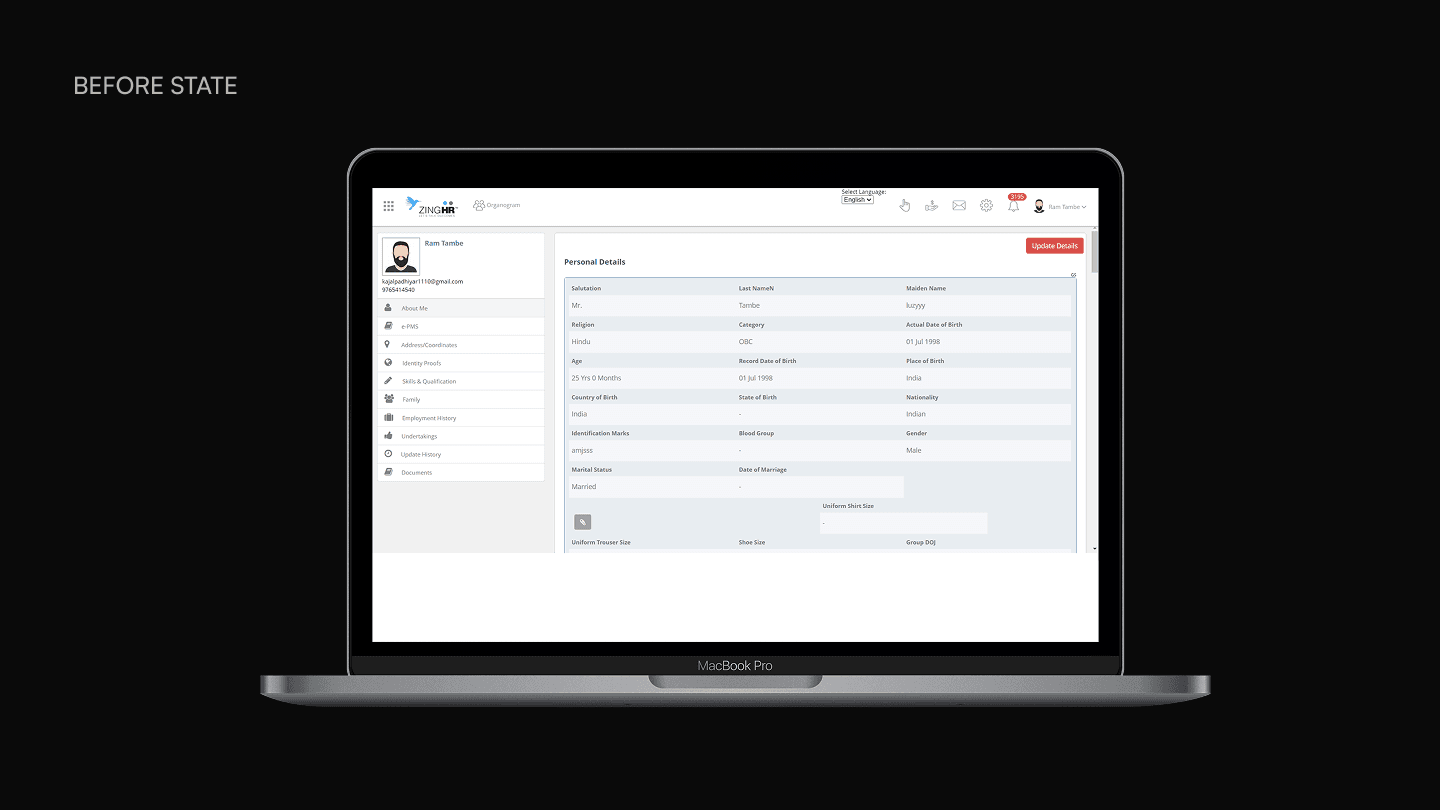
The existing version had accumulated friction over years of incremental feature additions without a corresponding design pass. Navigation was split across vertical tabs (About Me, e-PMS) and horizontal sub-tabs nested inside them, creating a two-axis structure that users had to learn rather than scan. Visual noise compounded the problem: persistent scrollbars appeared inside content areas that didn’t need them, underlines decorated fields inconsistently, and the overall layout gave no clear signal about which content was editable and which was read-only.
The most telling usability issue was a single “Update Details” button positioned ambiguously between sections. Users couldn’t tell whether tapping it would save changes to one section or the entire page. Worse, the system surfaced update prompts even when no data had changed, training users to distrust the interface rather than rely on it.
For a module that HR teams use during audits, managers reference in reviews, and employees depend on for paycheck accuracy, that distrust was not a cosmetic problem. It was an operational one.
Process
No brief. No research plan. Just the module.
The only direction was “redesign the Employee Dossier.” No user complaints were handed over, no support tickets were flagged, no specific pain points were pre-identified. So the first step was using the product myself, methodically, and documenting every point where I got stuck, confused, or had to guess. That self-directed audit surfaced the structural problems: the two-axis tab navigation, the ambiguous update button, the false save prompts, the visual noise from unnecessary scrollbars and inconsistent underlines. But auditing alone only reveals what’s broken. It doesn’t tell you what people have silently adapted to, or what they’ve given up trying to do.
Existing employees had adapted. New employees hadn’t. Both perspectives were necessary.
I spoke to coworkers across the company, deliberately splitting conversations between long-tenured employees and recent hires. The two groups surfaced completely different problems.
Long-tenured employees had internalized the dossier’s quirks. They couldn’t immediately point to issues because they’d stopped noticing them. Direct questions didn’t work. Instead, I asked specifics: “Do you know what this button does? Did it do what you expected? What does HR typically ask you to provide that should already be in your dossier? What did the employee dossier look like at companies you’ve worked at before?” Those questions broke through the familiarity and surfaced frustrations they’d stopped articulating.
Recent hires were the opposite. They hadn’t built workarounds yet, so every friction point was still visible. I gave them simple retrieval tasks and watched where they hesitated, where they looked first, and whether the information was where they expected it to be. The combination was critical. Tenured employees told me what the dossier failed to do over time. New employees told me what it failed to communicate on first contact.
The obvious solution broke against ZingHR’s product model.
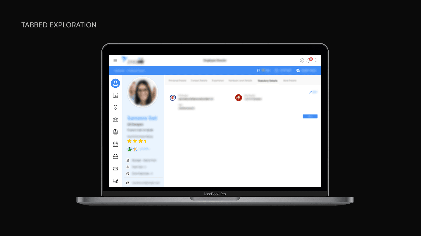
The first design direction replaced the vertical tabs with a persistent left navigation menu that expanded on hover, and converted the sub-sections into horizontal tabs, each with its own dedicated “Update Details” button. This solved the original ambiguity about what the update button controlled.
My design manager and the implementation team manager flagged the fundamental flaw: ZingHR is a product-based company that customizes modules per client. Every buyer configures the dossier differently depending on their size, function, and requirements. Some clients need twelve sections. Others need four. Clients can also add custom fields to any section, meaning one company’s “Personal Details” tab might contain thirty fields while another’s contains three.
The tabbed layout I’d designed already occupied the full page width with a fixed set of tabs. There was no room to add more. And for clients with sparse configurations, a tab containing a single custom field would leave the rest of the page visually empty. The design solved the navigation problem for one hypothetical configuration but broke for the range of configurations ZingHR actually ships. That feedback killed the tabbed direction entirely. The next solution had to work for a dossier with four sections and a dossier with twenty, with no layout changes between them.
A conversation about LinkedIn profiles reframed the problem.
The connection came sideways. A colleague was updating his LinkedIn profile ahead of a job search and asked me for feedback on how to optimize it. That conversation surfaced something obvious in hindsight: a LinkedIn profile and an employee dossier are structurally the same thing. Both are single-person records with variable sections, each independently editable, designed to be scanned rather than read end to end.
I brought the idea to my design manager before exploring it further. She approved the direction, and the structural fit became clear immediately. LinkedIn’s profile pattern resolved every concern that killed the tabbed approach. Scalability was no longer constrained by tab count or page width. New sections simply extend the page, whether a client configures four or twenty. Sparse sections with a single custom field sit naturally in a scroll layout without leaving a screen of empty space. And the continuous scroll eliminated the cognitive overhead of switching between tabs to build a complete picture of an employee’s record.
The key design decision was treating LinkedIn as a structural reference, not a visual one. The layout pattern transferred. The information density, hierarchy, and edit interactions were designed for ZingHR’s specific content types, client configurations, and user permissions.
Solution
The final design consolidates every piece of employee information onto one continuous page. Horizontal tabs at the top function as anchor links that scroll the user to the relevant section rather than swapping content between views.
Profile header as a persistent summary
The profile header stays visible at the top and serves as a snapshot of the employee’s identity within the organization. It surfaces the information that every user type needs on every visit: photo, full name, designation, employee ID, active/inactive status, and average performance rating. A profile completion indicator with a percentage bar gives employees a clear signal of how much of their record is filled out, paired with a last login timestamp that helps HR teams gauge engagement.
The right side of the header anchors organizational context: position code, employment type, reporting manager (with photo and title), team size, and direct reports. Contact details sit below. A QR code lets employees save and share a scannable link to their profile within the company, eliminating the need to search by name or ID when someone needs to pull up a record quickly.
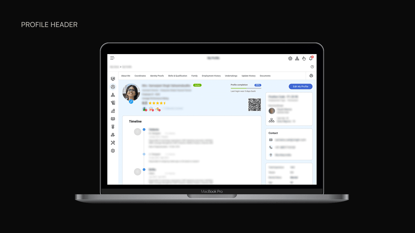
The header deliberately surfaces performance rating and reward badges alongside identity information. In the old design, performance data lived in a separate module entirely. Bringing a summary into the dossier header meant that managers opening an employee’s profile during a review or one-on-one could see recognition context without navigating away. The dossier became a starting point for conversations, not just a record.
Per-section editing with a pencil icon and side drawer
Each editable section displays a pencil icon next to the section title. Tapping it opens a side drawer where the user can modify fields and save. A snackbar confirmation appears on save. Sections that are read-only for the current user’s role simply have no pencil icon. There is no disabled state, no greyed-out icon, no tooltip explaining why editing is unavailable. The affordance is either present or absent.
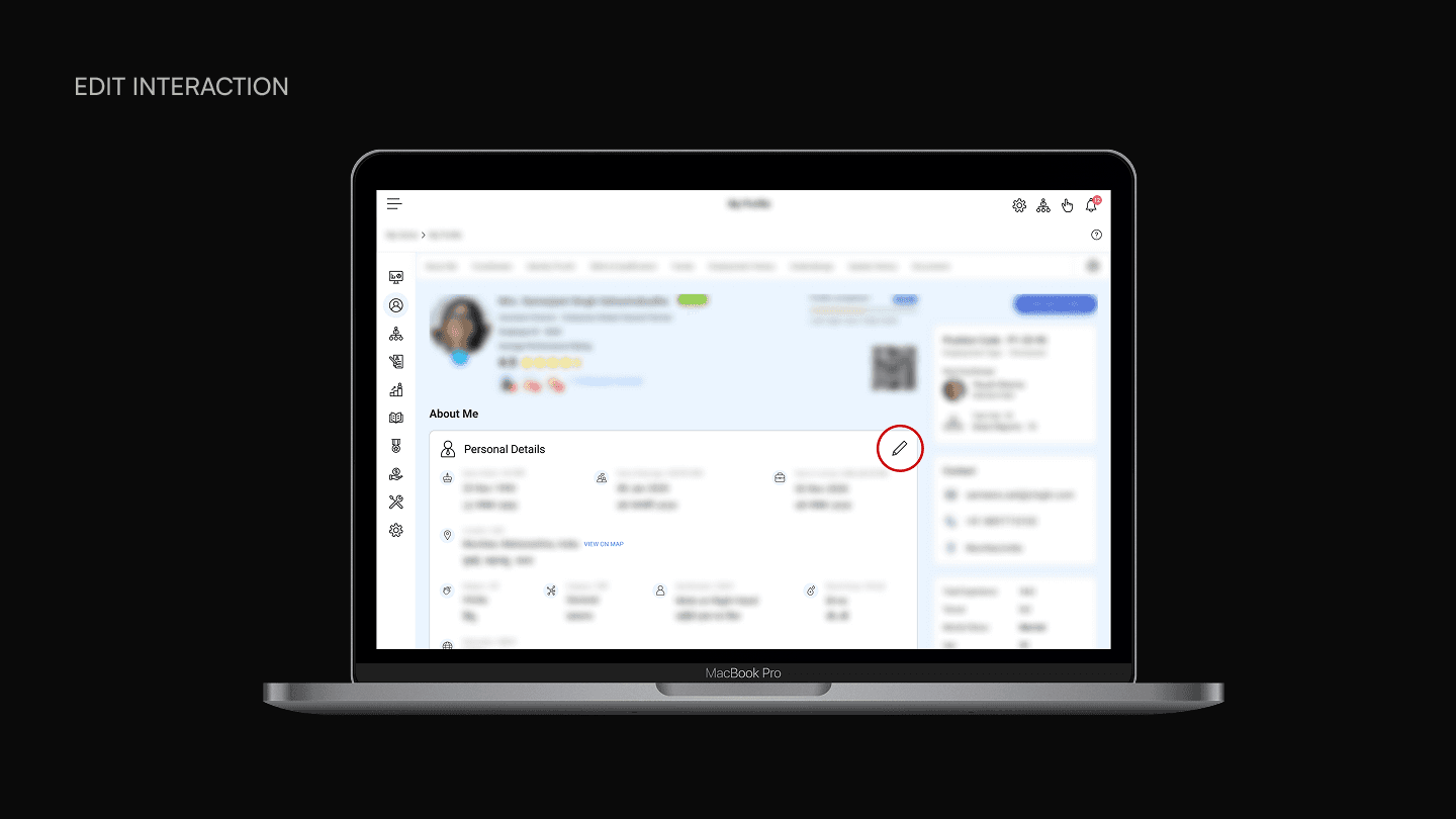
We considered showing a locked icon on read-only sections to communicate that editing exists but isn’t available to the current user. In practice, that created more confusion than clarity. Employees seeing a lock on their own profile assumed something was wrong or that they needed to request access. Removing the affordance entirely was cleaner: if you can edit it, you see the pencil. If you can’t, the section looks like a display, which is exactly what it is.
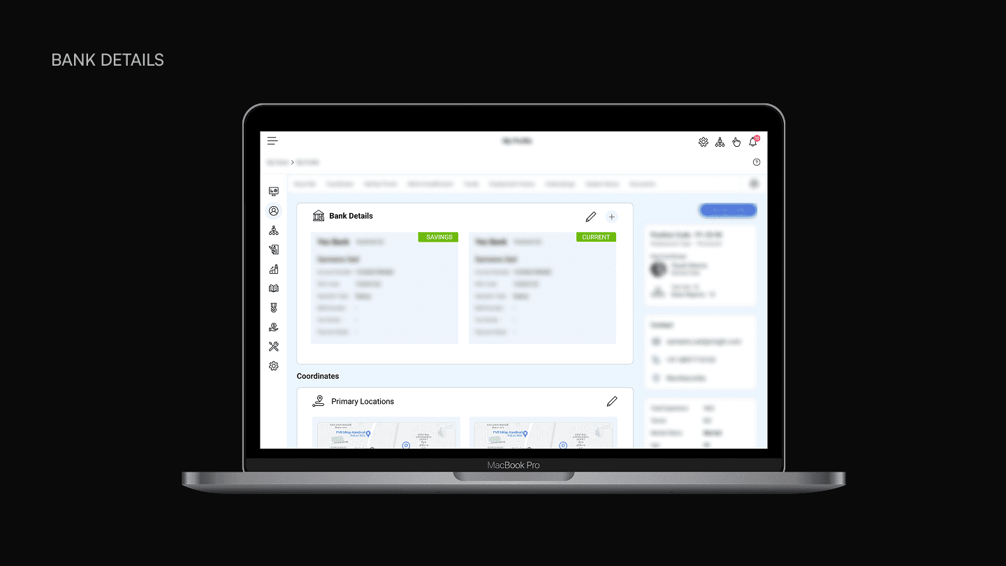
Sections that support multiple entries - like bank accounts, contact details, and emergency contacts - use colored badges to distinguish between them. Bank accounts are tagged by type (Savings, Current). Contacts and emergency contacts designate a primary entry. Bank Details and a few other sections also include a plus action alongside the pencil icon, allowing employees to add new entries rather than only editing existing ones.
Bilingual field labels
ZingHR’s client base spans multiple regions in India, and several clients require employee records to display in both English and a regional language. The dossier handles this by stacking the two languages vertically within each field: English label and value on top, the regional language equivalent directly below.
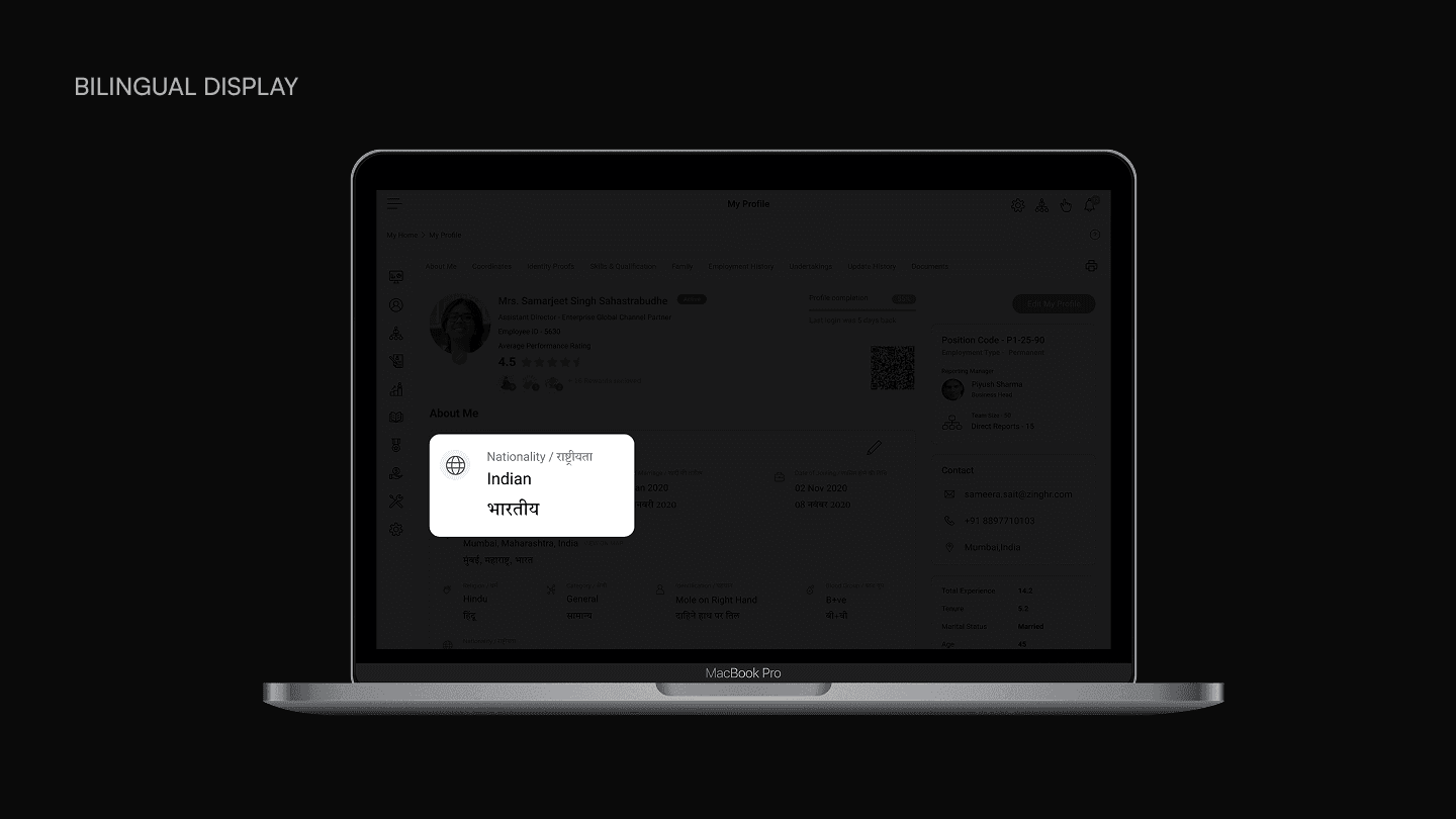
A toggle or tab-based language switcher would have been simpler to build, but it would have hidden one language at all times. For HR teams conducting audits or verifying records, having both visible simultaneously was a stated requirement. The vertical stacking keeps the layout consistent regardless of whether a client enables bilingual display or not.
Right sidebar for persistent context
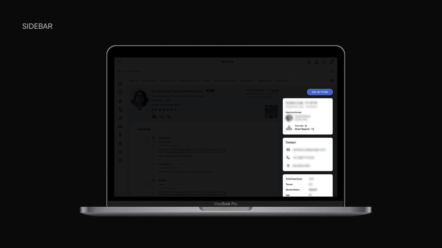
The right column functions as a persistent reference panel that stays visible as the user scrolls through the main content. It surfaces information that doesn’t belong in any single section but is useful across all of them: skills as pill tags, career highlights (previous companies, highest education, extracurriculars), and language proficiency with visual ratings.
This sidebar exists because of how the dossier is actually used. A manager reviewing an employee’s record during a staffing conversation needs skills and career context visible while scrolling through employment history or qualifications.
Configurable sections for client variability
The long-scroll structure directly addresses the configurability requirement that killed the tabbed approach. Each client’s dossier contains a different set of sections depending on their size, function, and requirements. Custom fields added by the client appear within the relevant section without requiring layout changes. The jump-link tab bar at the top dynamically reflects whatever sections are configured for that client, scaling from four tabs to fifteen without breaking the navigation pattern.
Impact
The redesigned Employee Dossier shipped as a default module across every ZingHR client deployment. Unlike feature-specific modules that clients purchase individually, the dossier is included in every account regardless of plan or org size. That baseline status meant the design had to work universally: for a 50-person startup and a 5,000-person enterprise, for clients with four configured sections and clients with fifteen, for employees editing their own records and HR admins auditing someone else’s. The long-scroll layout, configurable section structure, and per-section edit pattern have remained the foundation of the module since launch. No structural redesign has followed.
Reflection
What I learned
Designing for a configurable product is fundamentally different from designing for a fixed one.A layout that works for one client’s field configuration can break for another’s. The tabbed approach I explored first was a good solution for a single product. It was a bad solution for a platform where every deployment looks different. That distinction between product design and platform design was the most transferable lesson from this project.
Talking to long-tenured users requires different interview techniques than talking to new ones.New employees surface friction immediately because they haven’t adapted to it yet. Long-tenured employees have built workarounds they no longer notice. Asking “what’s wrong with this?” doesn’t work with the second group. Asking “what does this button do?” and “did it do what you expected?” does.
What I’d do differently
Push for a formal usability test after launch, not just before.The redesign was informed by internal interviews and validated through design reviews, but we didn’t run structured usability testing with actual client users post-launch.
Document the design system patterns earlier.The dossier introduced reusable patterns - the section card with pencil icon, the primary/secondary badge system, the bilingual stacking, the sidebar reference panel - that other modules at ZingHR could have adopted. I documented the final designs but didn’t formalize them as a pattern library until later.